Why ‘speaking the language of the business’ is both necessary and insufficient
This is the fifth post in a series about building design capability that scales. So far, I’ve looked at why insights don’t land, where…
Why ‘speaking the language of the business’ is both necessary and insufficient
This is the fifth post in a series about building design capability that scales. So far, I’ve looked at why insights don’t land, where coordination breaks down, and how team shape affects what’s possible. This post turns to a different problem: why design’s value often remains unrecognised, even when the work is good.
“Learn to speak the language of the business” is one of the most common pieces of advice given to designers who want more influence, and it matters. If you can’t connect what you do to what the organisation cares about, you’ll struggle to be heard. But fluency doesn’t guarantee influence. I’ve seen design leaders who are comfortable talking about OKRs, revenue, and strategic priorities but still find themselves fighting for resources, excluded from key decisions, or struggling to point to design’s impact beyond delivery.
Speaking the language gets you into the conversation, but it doesn’t tell you whether the organisation’s metrics actually capture what design contributes. It doesn’t help when design’s value is real but invisible in the business’ established measures, and it doesn’t build the kind of ongoing visibility that turns occasional wins into sustained credibility.
This post is about what fluency alone can’t solve: understanding what the business actually values, recognising when its metrics work against you, surfacing richer measures where needed, and building the feedback loops that make design’s contribution visible over time.
What the business actually values
You can learn to talk about revenue, retention, velocity, but those are the organisation’s official metrics. They’re not always the same as what drives decisions.
Every organisation has a gap between its stated priorities and its operational reality. The strategy deck says customer experience is a priority, but when budgets get cut, experience improvements are the first to go. Leadership talks about long-term thinking, but people get promoted for hitting quarterly targets. There’s what the business says it values, and then there’s what it rewards, funds, and pays attention to when things get tight.
If you’re connecting design’s value to the stated priorities without understanding the unspoken ones, you’ll find yourself making arguments that should land but don’t. The metrics are right, the language is right, but you’re not speaking to what really matters in the room.
This isn’t cynicism, it’s the reality of messy organisations and human motivations. Understanding the gap helps you pitch work more effectively, identify where design genuinely aligns with operational priorities, and recognise when you’re fighting an uphill battle.
What to try:
- Watch what gets funded when resources are tight, not what gets talked about when they’re plentiful. That’s where real priorities show up.
- Pay attention to what leaders celebrate and who gets promoted. The behaviours that get rewarded tell you more than the values on the wall.
- Ask people outside design what they think leadership actually cares about. You’ll often hear a different story than the one in the town hall.
- When you’re pitching work, test whether you’re connecting to stated priorities or operational ones. If it’s only the former, you may need a different angle.
The problem with borrowed metrics
Design teams often adopt the metrics already in use around them: NPS, conversion rates, task completion, velocity, story points delivered. It feels pragmatic because the organisation already tracks these things, so connecting to them seems like the path of least resistance.
But most of the time, these metrics weren’t designed with design’s contribution in mind. They measure outcomes that design influences but doesn’t control, or they capture only a narrow slice of what good design provides. Conversion rate might go up because of a clearer interface, or because of a promotional offer, or because a competitor’s site went down. Velocity measures output, not whether the thing that shipped was worth building.
The risk is that design becomes invisible in its own success. When a product does well, the metrics credit the feature, the campaign, the quarter’s priorities, but not the work that shaped them. When design prevents a problem, like a confusing flow that never shipped or a risk identified early in research, there’s nothing to measure at all. The avoided failure doesn’t show up anywhere.
There’s a subtler problem too. When you optimise for borrowed metrics, you start shaping the work around what’s measurable rather than what matters. Teams chase conversion improvements that don’t add up to a better experience. Research gets scoped to answer questions that fit the reporting cycle. The metrics become the goal instead of a proxy for it.
Also, when something isn’t measured, it’s easy to neglect. Not out of malice, but because there’s no signal when things go wrong. If you’re not tracking trust, you might be eroding it without realising. If you’re not measuring how policy changes affect the people who interact with your service, you might be creating friction that never surfaces until it becomes a crisis. A measure isn’t just a way to prove value, it’s a way to hold yourself accountable for the impact you’re having, including impact you didn’t intend.
None of this means you should ignore the organisation’s metrics, but you need to recognise when they’re working against you, when they make design’s contribution invisible, or when they incentivise the wrong things.
Surfacing what actually matters
If the organisation’s existing metrics don’t capture what design contributes, part of the job is helping the business see value it currently doesn’t measure. This is different from reporting on design activity, counting screens shipped or research sessions conducted. Activity metrics show that design is busy, but they don’t show that design is useful.
The richer measures are ones that connect design work to things the business cares about but isn’t tracking well.
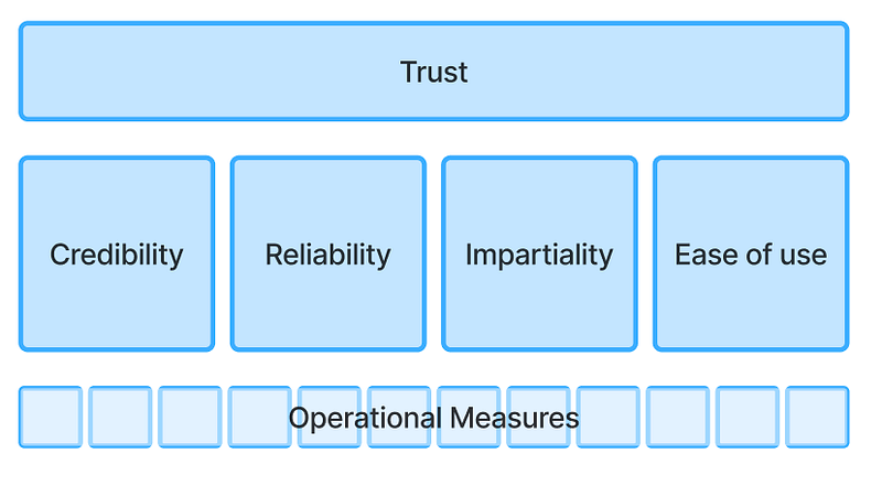
I recently worked with an organisation that measured success through customer satisfaction scores. On the surface, this seemed reasonable, most organisations do this. But their role involved setting rules that sometimes blocked other companies’ decisions, enforcing compliance, and facilitating disagreements. Even when they were doing their job well, their customers weren’t going to be “satisfied” in any conventional sense. Satisfaction was the wrong frame.
What actually mattered for their customer relationships was trust. Companies needed to trust that decisions were fair, consistent, and well-reasoned, even when those decisions went against them. We pivoted from satisfaction to a trust score, because trust was what drove strong working relationships, not happiness.
But trust is abstract. To make it operational, we needed to understand what drives trust in that context. We developed four underlying measures: Credibility, Reliability,Impartiality, Ease of use.
Each of those connected to operational measures and activities that teams could actually influence day-to-day.
This is the shape of the work: start with what actually matters for the relationship or outcome you’re trying to support, then work down to what drives it, then connect that to things you can observe and affect.
What to try:
- Question whether the current top-level measure actually captures what matters. If you were doing your job brilliantly, would this metric reflect it? If the answer is “not necessarily,” you may need a different frame.
- Identify what actually drives the relationship or outcome you care about. This often requires research, not assumption, to get right.
- Break the high-level measure into underlying drivers. Trust might break into credibility, reliability, and fairness. Adoption might break into ease of getting started, early value realisation, and integration with existing workflows.
- Connect operational activities to those drivers. What would you expect to see if credibility were strong? What activities support reliability? This is where the measure becomes actionable and where teams can see how their work connects to the outcome.
Making design’s value visible over time
Getting the right measures in place matters, but measurement alone doesn’t build influence. A single data point, even a good one, is easy to dismiss or forget. What changes perception is a pattern: consistent evidence that design contributes to outcomes the organisation cares about.
This is where many design teams fall short. They do good work, occasionally surface its impact, but don’t create the ongoing visibility that turns isolated wins into sustained credibility. Each project becomes a fresh argument for design’s value, rather than the latest evidence in an established case.
Part of the problem is framing. Design teams often pitch their value in terms of better experiences: clearer interfaces, easier flows, more satisfying interactions. This isn’t wrong, but “better experience” sounds discretionary. Something you invest in when there’s room in the budget. Leaders nod along, but when priorities get set, experience work ends up near the bottom.
A more durable framing connects design to things leadership already treats as essential: reducing risk and creating opportunity.
Research that validates a direction before engineering starts reduces the risk of building something nobody wants. Testing a flow before launch reduces the risk of drop-off, support load, or reputational damage. These aren’t soft contributions. They’re the difference between catching a problem early and discovering it in production. But because the failure never happened, there’s no visible save. The feature that would have flopped was never built. The damage to trust that would have taken months to repair never occurred. Design’s contribution disappears just like the bad decision not taken.
On the opportunity side, a well-designed onboarding flow isn’t just pleasant, it’s a lever for activation and retention. A clearer product story helps sales close faster. A coherent service experience differentiates you in a market where features are easy to copy. Design work that seems cosmetic often has commercial consequences that go unrecognised because nobody framed them that way.
Making this visible requires feedback loops: connecting what design does to what happens next, and making that connection visible over time.
What to try:
- Document the small pains avoided. When research catches a problem early, write down what would likely have happened without it. The outcome won’t be provable, but making it explicit creates a record.
- Track near-misses, not just successes. When research kills a feature or redirects a project, note it. Over time, you build evidence for things that didn’t go wrong because you caught them early.
- Pick one area where design has contributed to improvement and track it consistently. Over the last six months, have research-informed features outperformed those that skipped research? Have support tickets dropped for flows you redesigned? These patterns create narratives that are hard to ignore.
- Look for where design’s contribution could slot into existing reporting rhythms. What does leadership already review? Where could design’s impact show up in numbers they’re already looking at?
- Develop a short version of your impact story, something you can say in two minutes when the opportunity arises. Not as self-promotion, but as a case study: what you found, what changed, what would have happened otherwise. Stories stick where metrics don’t.
Catching what reporting misses
One more thing worth noting. Regular reporting surfaces what you’re already looking for, but sometimes the most important signals are the ones you didn’t anticipate.
In the Viable System Model, this is the function of System 3*: monitoring that operates outside normal reporting to spot things the routine channels might miss. It’s how urgent signals can bypass the usual hierarchy to reach decision-makers before a problem escalates.
Design teams are often well-placed to perform this function. Researchers hear things in interviews that don’t fit neatly into project deliverables. Service designers mapping a journey spot friction that no one is tracking. Designers working close to customers notice patterns of confusion that haven’t made it into the metrics yet. This is valuable intelligence, but only if it has somewhere to go. A troubling insight spotted by a researcher is only useful if it can get to the people who can act on it, without being filtered out because it doesn’t fit the usual reporting structure. This is as much about relationships and access as it is about measurement.
Where to start
If you’ve recognised some of these gaps, don’t try to fix everything at once. Start with one entry point based on where you’re feeling the most friction.
If your arguments aren’t landing: The problem may be a gap between stated priorities and real ones. Spend time understanding what actually drives decisions, then reframe your pitch around those realities.
If design’s contribution keeps getting overlooked: Look at whether the metrics in use actually capture what design contributes. Identify one area where a richer measure would make design’s impact visible, and connect it to something leadership already cares about.
If you’re always starting from scratch: The issue is likely a lack of feedback loops. Pick one area where design has contributed to improvement and start tracking it consistently. Build the habit of closing the loop.
If “better experience” isn’t compelling enough: Reframe design’s contribution in terms of risk reduction and opportunity creation. What problems did design help avoid? What opportunities did it open up?
None of this is quick. Changing how an organisation understands design’s value takes time and consistent effort. But each of these entry points gives you something concrete to work on, something that can shift perception incrementally rather than waiting for a single transformative moment that rarely comes.
The final post in this series will pull these threads together: what does it actually look like when all five functions are working? How do you sustain capability over time rather than constantly rebuilding it? And what does this mean for the people doing the work?